
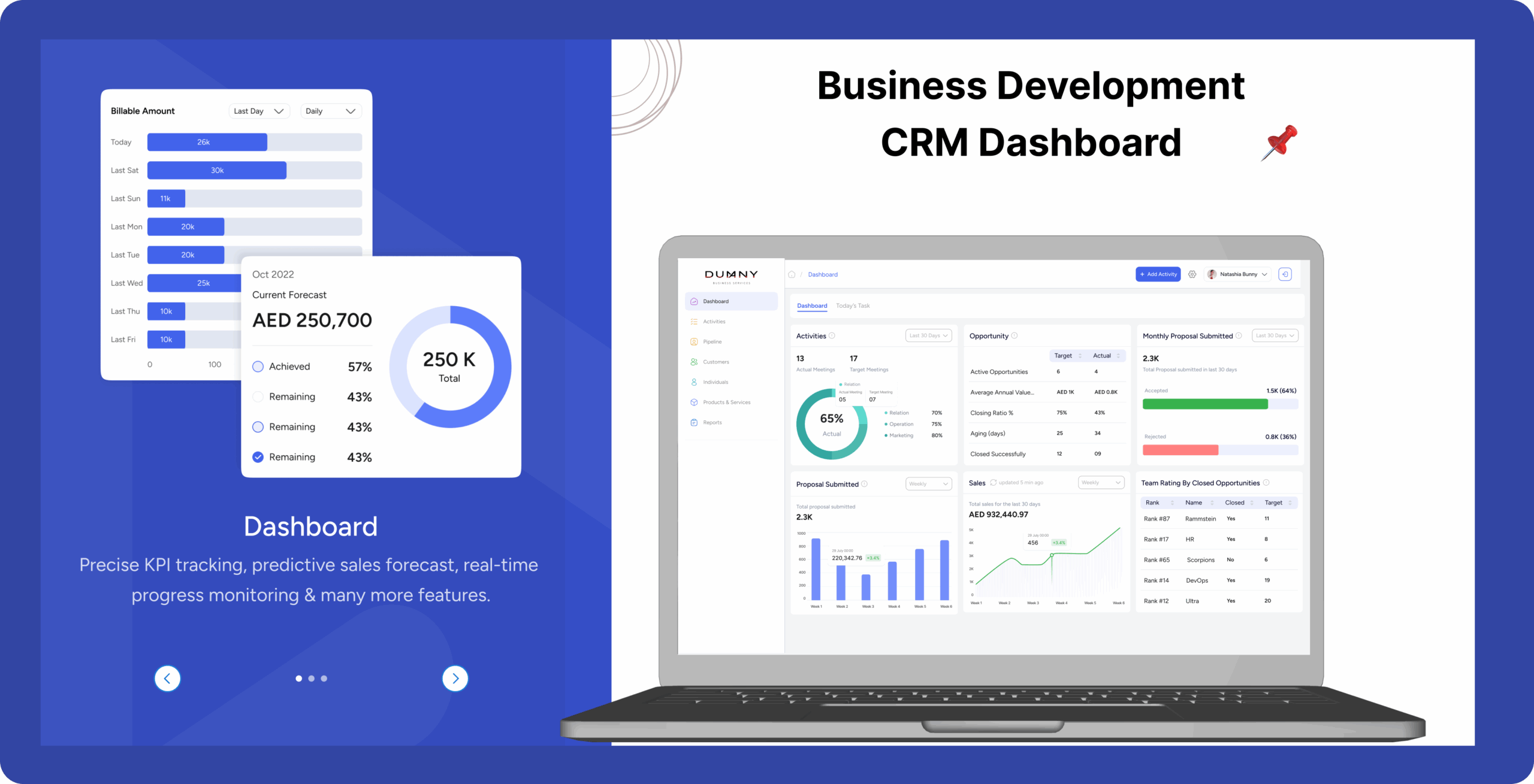
Business Development CRM Dashboard
 CRM Dashboard
If your team spends more time figuring out software than making sales, you’ve got a problem……
Your Team Should Be Closing Deals, Not Struggling with Tools

Overview
CRM systems designed to boost productivity, foster lasting customer relationships, and generate measurable business results, crafted with users in mind—streamlining workflows, enhancing engagement, and enabling smarter decision-making.
Dumny CRM is a modern dashboard design concept aimed at transforming how teams manage leads, execute campaigns, and evaluate performance—all within a clean, intuitive workspace.
This case study explores the complete UI/UX journey, starting from identifying common pain points in traditional CRM systems to crafting a responsive and scalable dashboard solution.
The design emphasizes clarity, efficiency, and adaptability, offering a streamlined experience for sales and marketing teams.
Problem Statement
Existing CRM are Cluttered and complex to use.
They lack essential automation for smooth lead and sales managment
Hellen Wangeci
UI/UX Designer
Most CRMs are cluttered with excessive features and chaotic layouts. Our goal is to design a cleaner, more intuitive interface that enhances usability and streamlines user experience.
Alex Kimani
Product Manager
Traditional CRMs are often difficult to learn and lack automation for basic tasks. Our vision was to create a solution that saves time and feels intuitive right from the start.
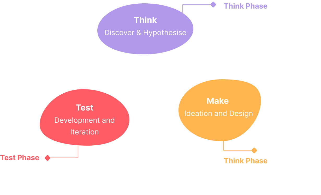
Design Process
Creating Dumny CRM wasn’t just about a clean visual interface—it was about solving real business challenges through intentional, user-focused design.
This project followed a user-centered design process grounded in the Lean UX methodology, emphasizing clarity, functionality, and data-driven decision-making.
The journey began in the Think phase, where we conducted user research and defined core problems. In the Make phase, we translated insights into prioritized features, wireframes, and prototypes. Finally, during the Test phase, we developed a Minimum Viable Product (MVP) and iterated based on real user feedback.
Every design decision was made to simplify daily operations and enhance the user’s workflow—ensuring the final product delivered meaningful impact.
Designing with a Lean UX Mindset

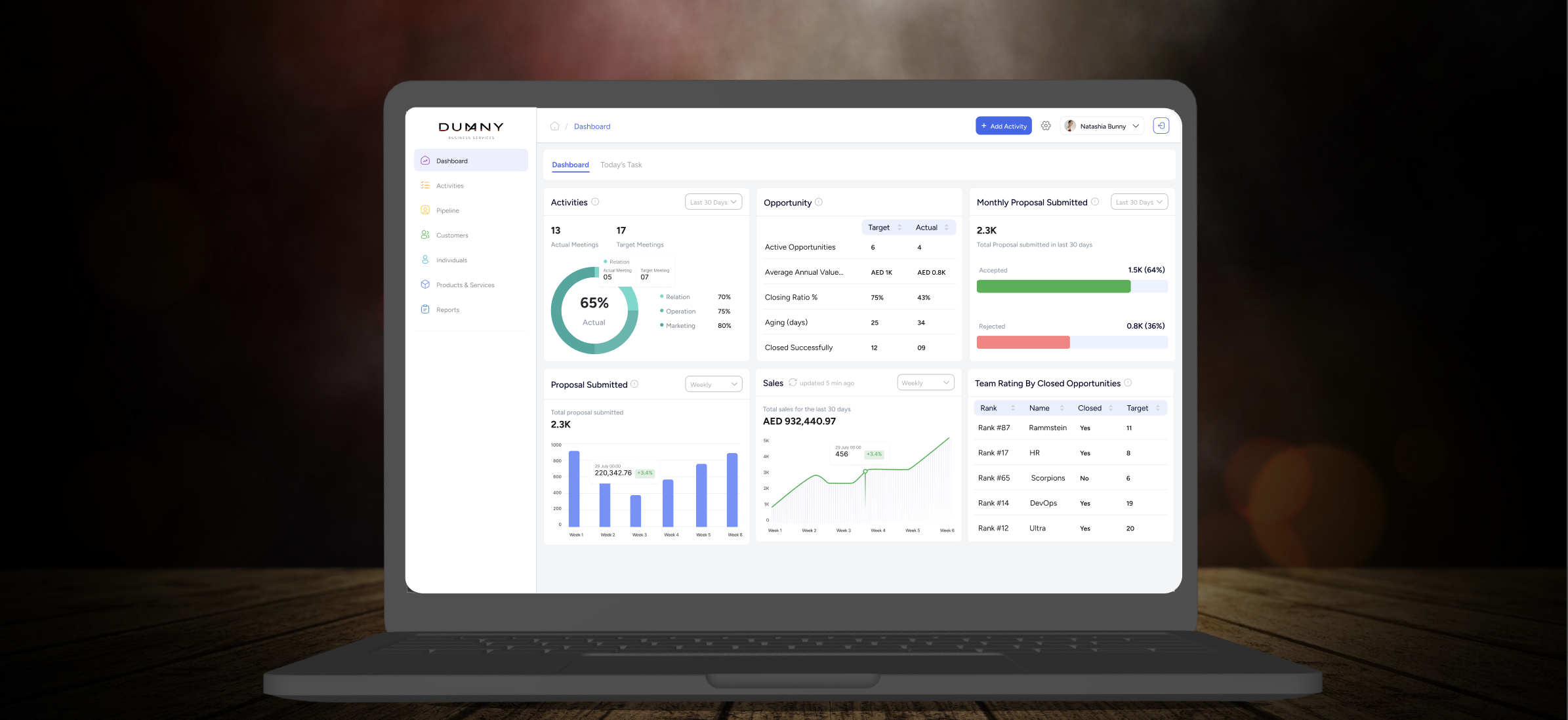
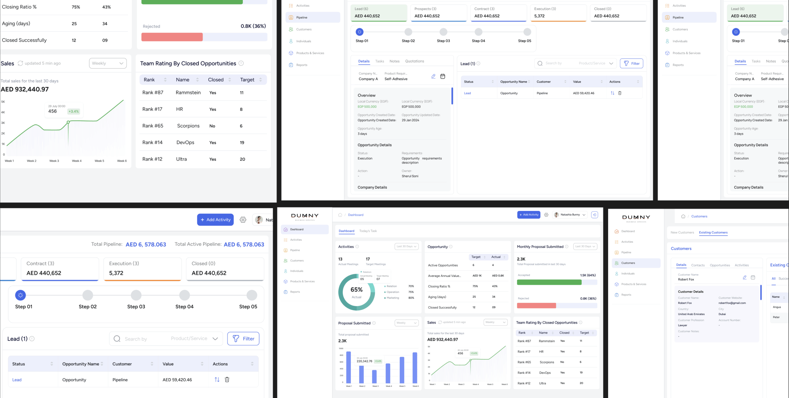
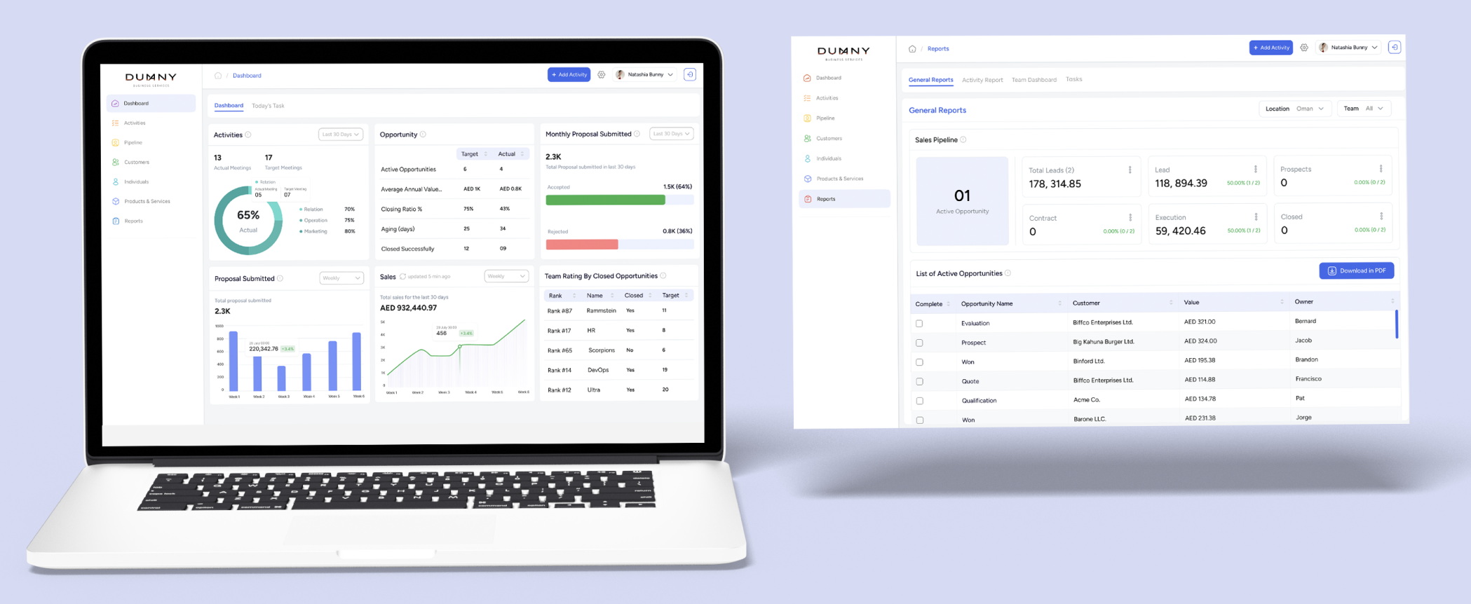
UI Screens – Dashboard
The CRM Home Dashboard provides users with a streamlined overview of their business performance. Designed for clarity and ease of use, it delivers key metrics and insights in a single, intuitive interface—empowering teams to make informed decisions quickly.
Results Overview
Enhanced tracking and management of sales opportunities due to the pipeline’s clarity.
40%
Time Saved
Enhanced tracking and management of sales opportunities due to the pipeline’s clarity.
3X
Conversion Rate
Enhanced tracking and management of sales opportunities due to the pipeline’s clarity.
60%
Reduction in Missed Leads
What I Learned
Working on PulseCRM deepened my appreciation for how intuitive UI design can drive real business outcomes. The dashboard was crafted to balance data density with visual clarity, making complex metrics—like revenue trends, proposal performance, and opportunity pipelines—instantly understandable.
Throughout the project, I gained hands-on experience in:
- Applying design thinking frameworks (from empathizing to testing) within a CRM environment
- Prioritizing usability and accessibility while managing dynamic, data-rich content
- Building modular components such as charts, filters, and performance indicators that scale across teams
- Creating a dashboard that’s not only visually appealing but also actionable and efficient
This experience strengthened my ability to design with both functionality and user empathy, ensuring every element serves a purpose in enhancing productivity.
Conclusion:
The business dashboard project has been a resounding success, demonstrating the impact of thoughtful UI/UX design on business operations. By focusing on user needs and implementing a solution that addresses the core issues, the dashboard has not only improved efficiency but also become an indispensable tool for the sales and management teams. This project serves as a testament to the power of design in solving real-world problems and driving business success.